October 26, 2018
Avalanche forecasts currently come with some specificity through the use of “Avalanche Problems”, we now get:
- Avalanche Character
- Location
- Likelihood
- Size
This methodology for forecasting allows the user to better understand the information the forecaster is trying to communicate. If you are unfamiliar with this style of forecast this short video is a great resource, Avalanche Problems Explained by the National Avalanche Center.
Once you understand the 4 avalanche problems the next step is to plan your trip and travel through the mountains avoiding the hazard as much as possible or mitigating it by choosing low consequence terrain when getting into the suspect areas. The goal is to visualize where the problems are and act accordingly. Since we are talking about terrain it seems reasonable to map the hazard based on the forecast. Fortunately we live in a time where GIS technology allows each one of us to do that and build it in a way that is personally intuitive. Here is a video on how to do just that, once you watch scroll past the video for a bit more info.
Please place your YouTube settings to HD
IMPORTANT: This will map start zones that are forecasted. You can still be exposed to the hazard if you are in the runout. The “size” element of the forecast cannot be taken into consideration with currently available slope shading techniques. Also, you may trigger an avalanche remotely from lower angle terrain or lower angled adjacent slopes may get pulled out during an avalanche. The overall hazard (Low, Moderate, Considerable, High, and Extreme) gives you insight as to the likelihood of those situations.
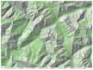
Now that you’ve watched the video I have a more complete map that I made from the mock forecast in the video. What I did was added color to steeper terrain, so the persistent slab aspect and elevation between 43- 55 degrees is purple and the wind slab aspect and elevation between 43-55 is light blue. Also for those that want to see where the “generally safe” slopes are I colorized all aspects and elevations between 0-29 degrees bright green. The power of this is that you can colorize the slopes as you see fit and in a way that is intuitive for you.
Here is the map key, it is also on the SW corner of the map.

Click the thumbnail of the map to open up a high resolution image of it in a new tab.
![]()
![]()
![]()

